
Create your own innovation portfolio in three simple steps
Disciplined innovation management at scale.

Innovation is a numbers game.
You need to test many ideas, take the best to market, and then test them again. Some will fail, and some will generate varying levels of success. But one thing is sure—betting it all on one single genius idea is most likely to lead to failure.
Taking it to other extreme, i.e. focusing only on quantity and seeing what sticks, is also a recipe for disaster. Deep pockets do not guarantee success.
Quantity and quality of ideas are needed to reap attractive return on innovation investments.
In this article I will dive into how executives can manage a great number of such investments using a portfolio approach. I primarily focus on the strategic lens, but do provide resources for more tactical matters at the end.
The purpose of portfolio approach is to provide a big-picture overview of all your investments, with sufficient information to make an informed decision if some of them should be bolstered, revisited, or stopped.
You can use the following three steps to design any number of portfolio views.
Step 1: Decide what you want to track
The first step is determining what will be tracked in the portfolio. Ideas? Projects? Teams? Any investment?
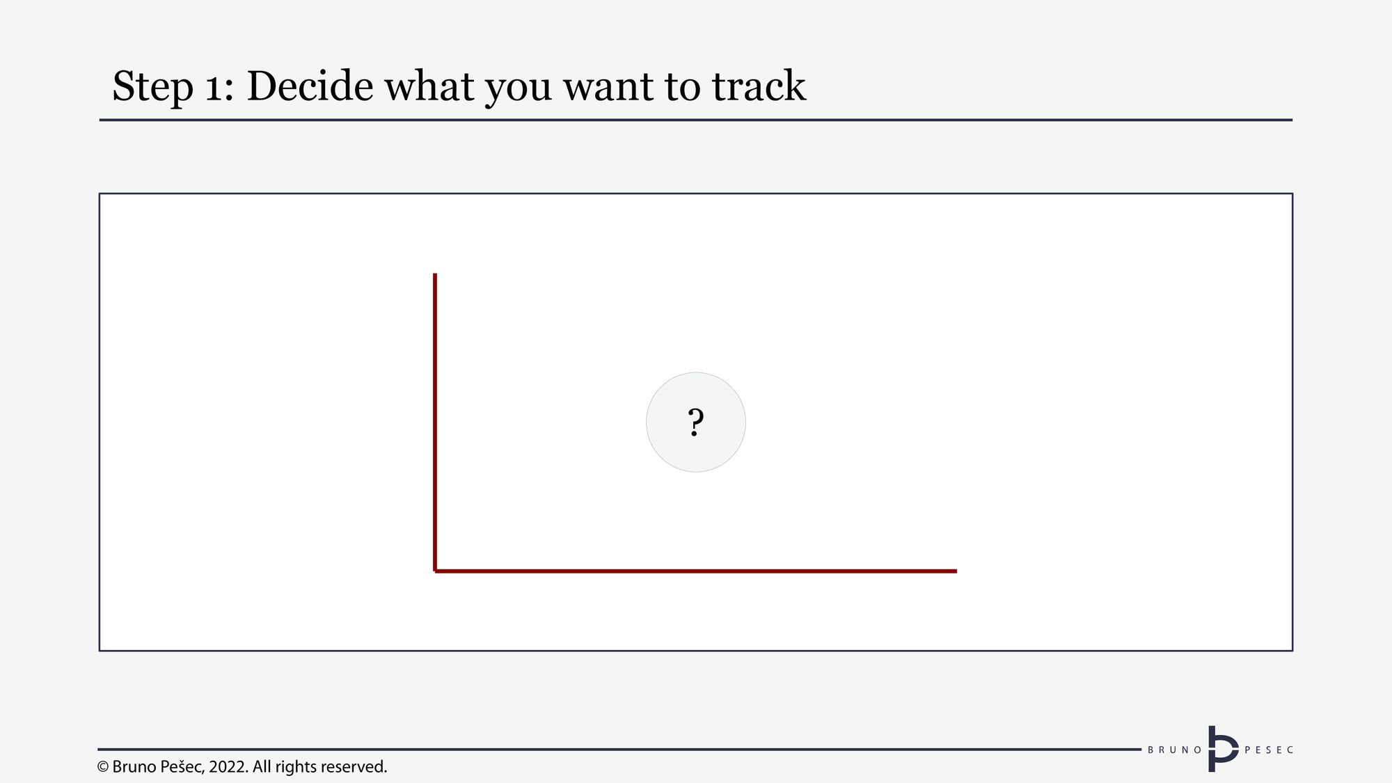
Since we are talking about innovation portfolio, my usual suggestion is to track specific innovation projects. The latter are defined as having a specific idea, assigned team, and clear objective.
You can call them “initiatives” if you dislike the word “project.”
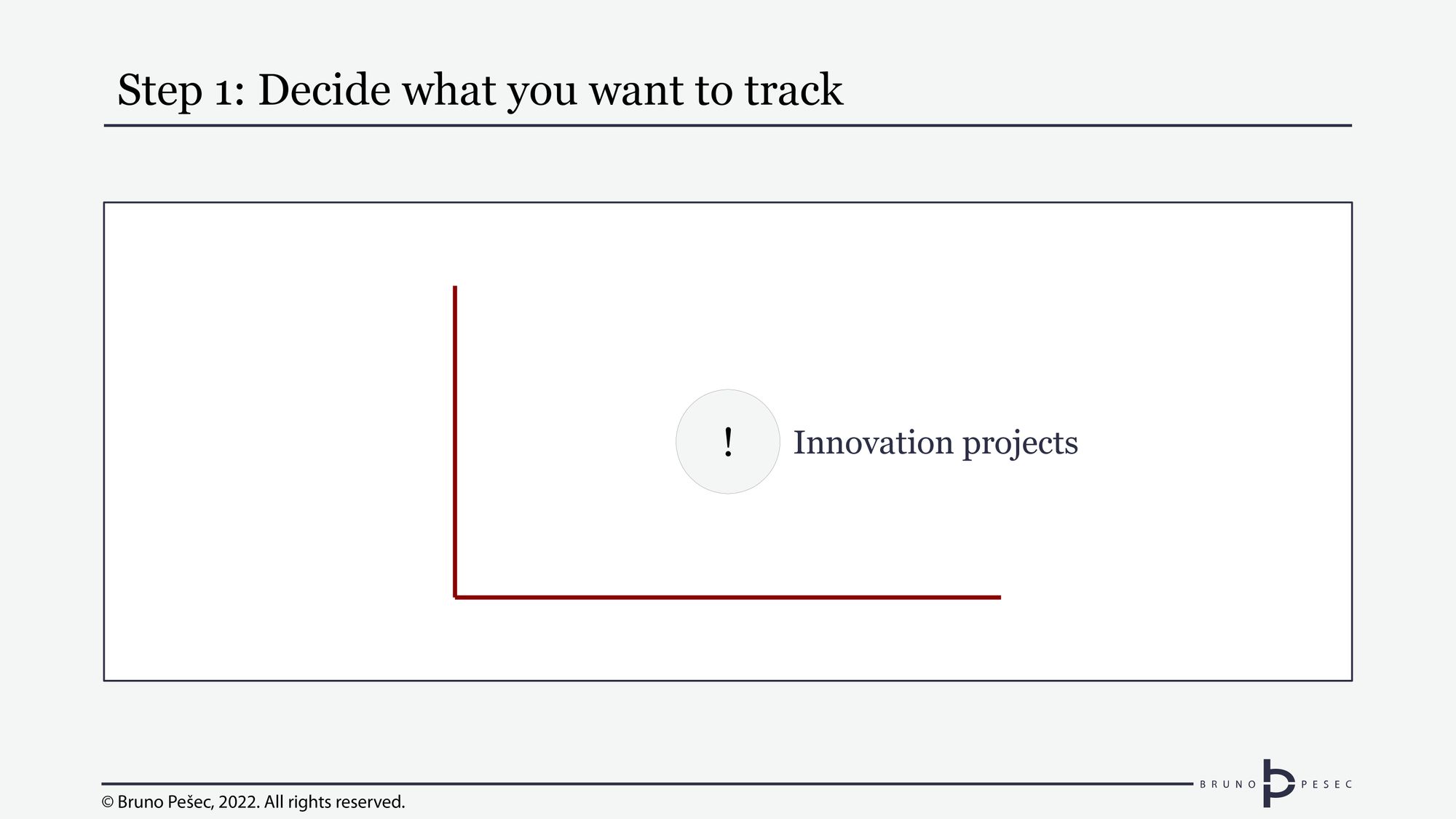
Focusing on projects in this context is beneficial, because you want to “kill” as many of them as possible, should the evidence indicate that is warranted. Killing teams, on the other hand, would be wildly inappropriate.
Step 2: Decide what are the key dimensions
The second step is deciding on the main dimensions of the portfolio. These are usually the horizontal and vertical axes of the portfolio diagram:
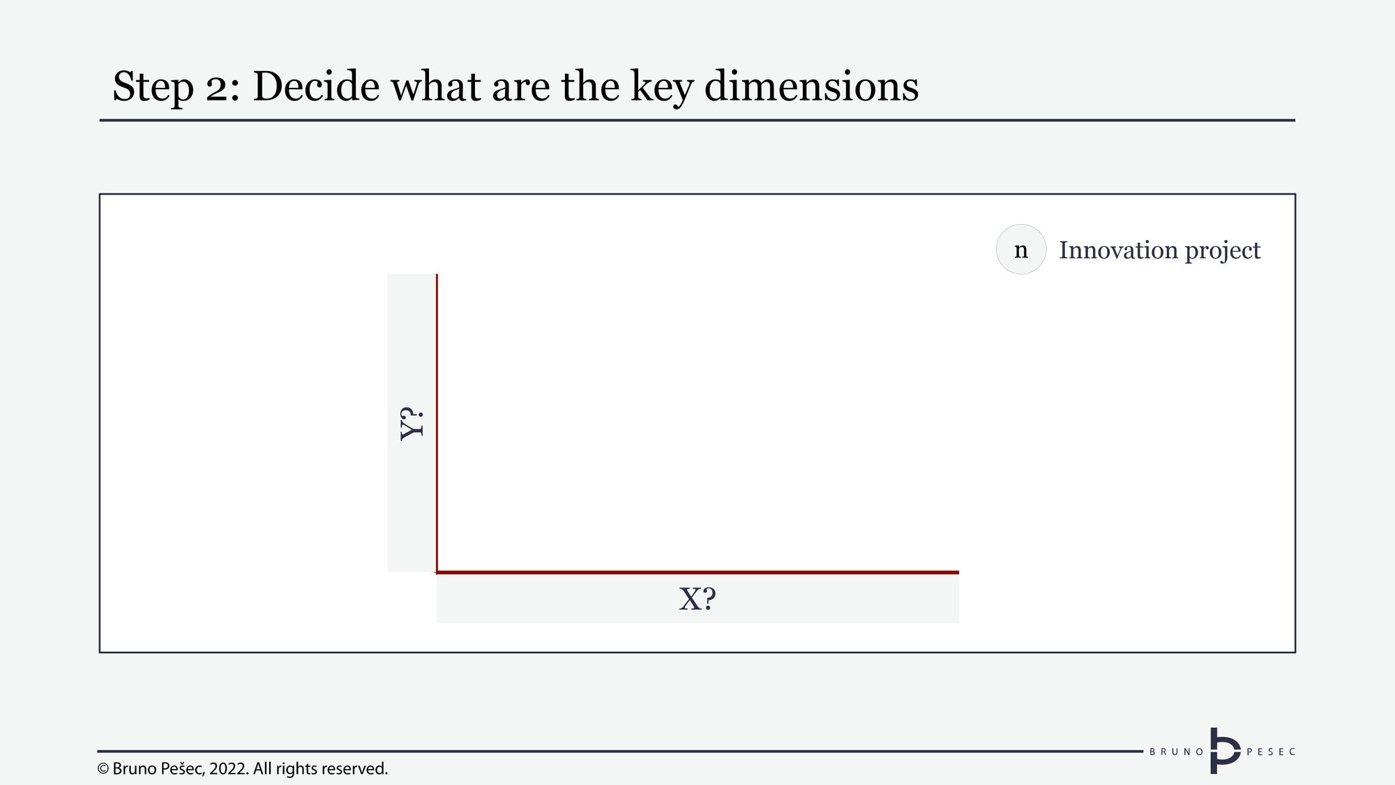
The dimensions should be carefully selected, as they frame anything that will be presented in the portfolio.
A good way to approach this step is to answer the following:
“What kind of questions do we want to ask the portfolio?”
“What kind of answers do we want to get back?”
“What do we plan to do with that information?”
If you decided to track innovation projects, two common questions are:
“How far have they come?”
“What kind of innovation are they bringing to the table?”
“Are they worth investing in?”
The first question is a matter of lifecycle management, while the second relates to types of innovation, and third to good old revenue potential.
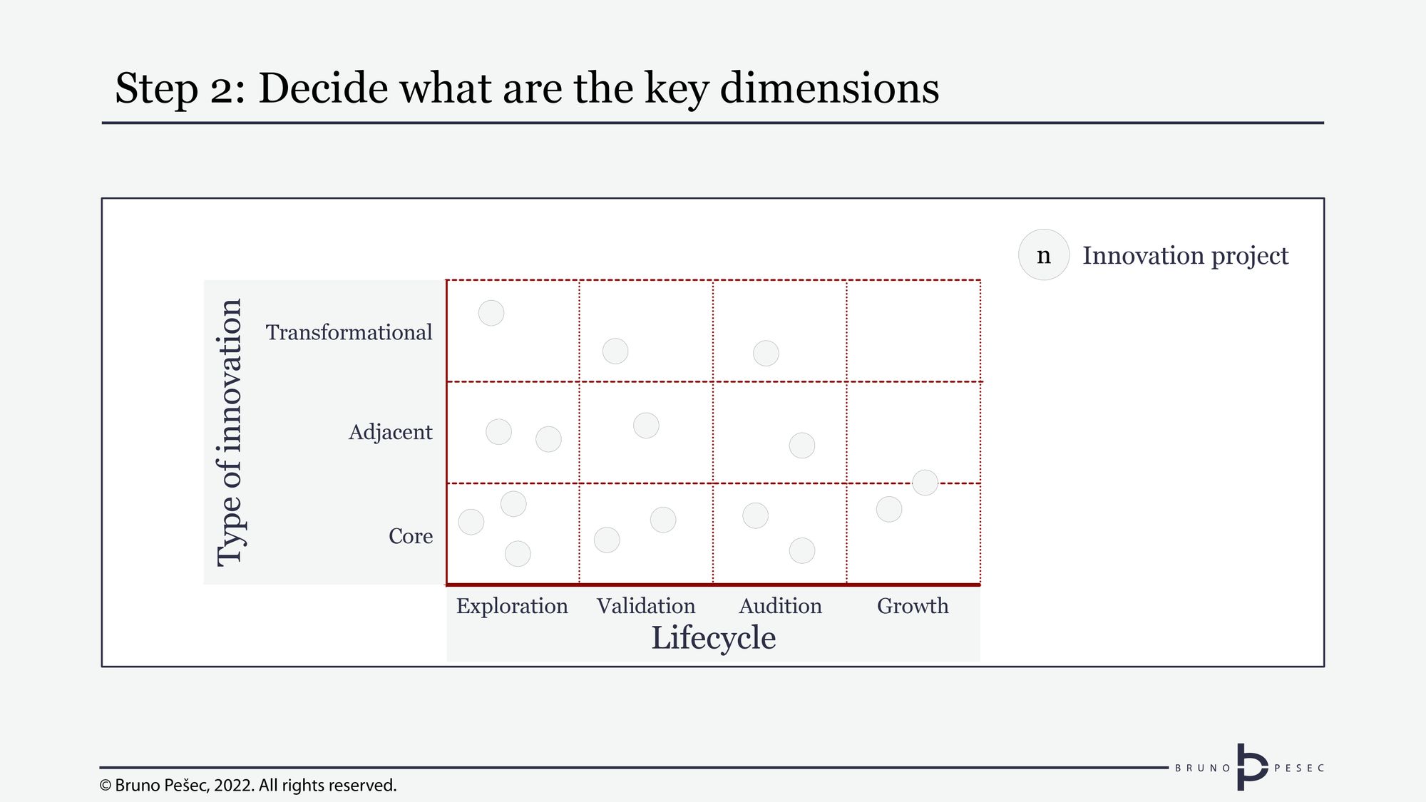
Let’s say that in this case you decide to have the lifecycle and type of innovation as your axes:
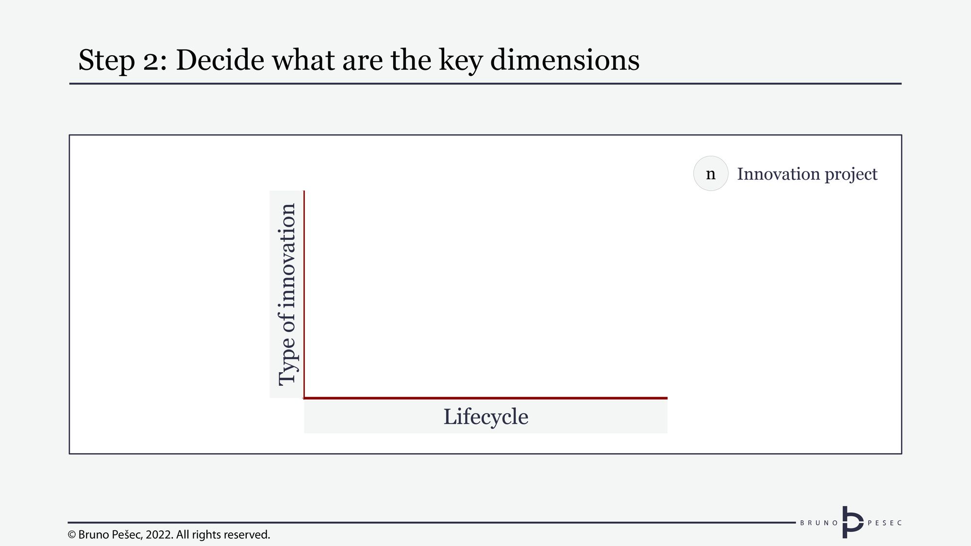
These are obviously qualitative dimensions, i.e. they are more about categorisation than exact numerical values. In order for them to be useful, their sub-divisions must be easily distinguishable from each other.
Lifecycle could be broken down into distinct categories like “exploration,” “validation,” “audition,” “growth,” “maturity,” and “decline.” (You can read more on the phases in Granular view of the biggest innovation risk article). In this case, we will actually stop at “growth,” because we decided that whatever has reached “maturity” stage has either been sold or absorbed by main business.
At this moment, our chart looks like this:

Now is the time to decide on types of innovation. There are many different typologies, but let’s go with a well known one from Tuff and Nagji: core, adjacent, and transformational. It’s critical to come up with your own definitions of each type, otherwise you risk internecine warfare for each project.
Simple definitions I’ve used in the past are:
- Core: serving existing customers with existing value propositions.
- Adjacent: serving new customers existing value propositions or serving existing customers new value propositions.
- Transformational: serving new customers new value propositions.
Above aren’t the holy writ and can be expanded as needed for your specific case. What’s important is that they are good enough for people to intuitively understand the type of innovation at hand, while leaving enough space for open discussion.
Adding them, the chart now looks like this:

Adding innovation projects to them is a trivial matter, simply place in the dots:
Now is good time to add details—but not too much!
Step 3: Add vital details
You still have one unanswered question:
“Are these projects worth investing in?”
What does that mean to you? Let’s say you want to know about revenue potential of each project. That can be depicted by connecting the size of the dot to its revenue* potential. The bigger the dot, the bigger the potential:
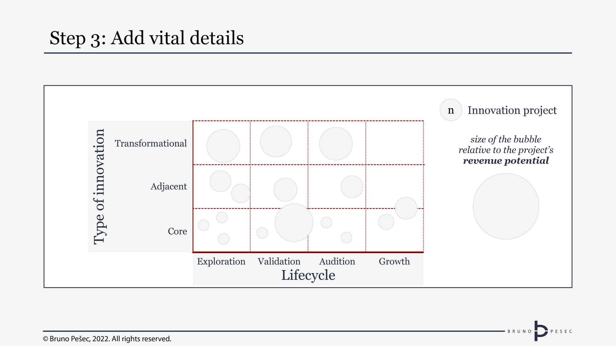
*Value-to-cost ratio is a good proxy for ROI, but I would advise it only to more experienced leadership teams. It requires a rather mature handling of estimates.
Don’t stop here, though. Remember, the only thing certain about innovation is that it is uncertain. You can do everything right and still fail. As projects progress through the lifecycle, they should have more and more certainty. Early stage project are expected to have the most uncertainty.
What you can do is add another layer of information: risk-adjusted revenue potential. That could be visualised with a dashed circle inside the dot. Since risk will always be expressed as number lower than 1, the dashed circle will always be on the inside.
This information is useful at glance because it tells you more about the risk level of the project. If there is big difference between the circle and dashed line, that means that uncertainty is huge. If they are close, that means the people responsible for the project believe they have it all nailed. Both are signals for further inquiry.
The chart now has four elements:
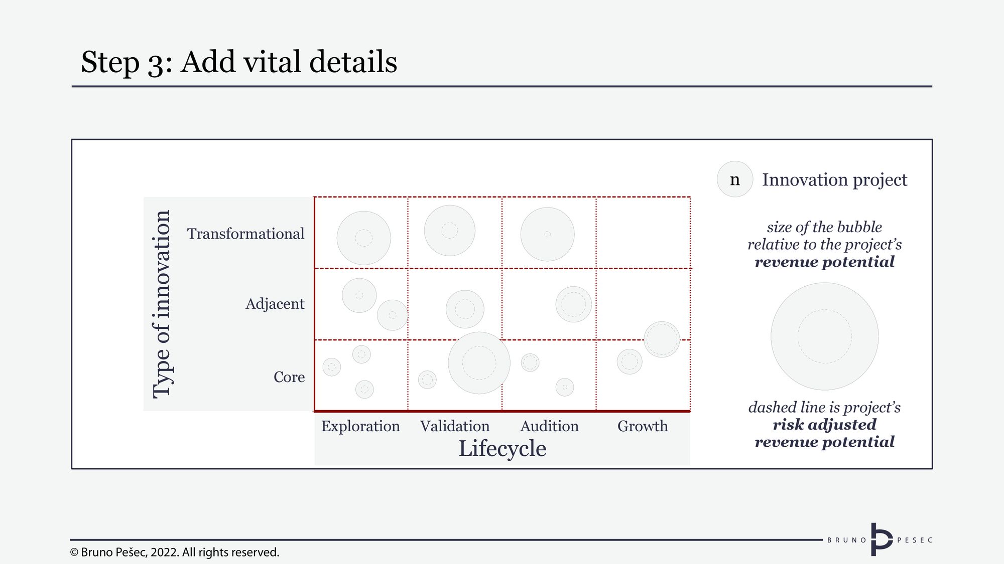
It’s getting a bit busy, isn’t it?
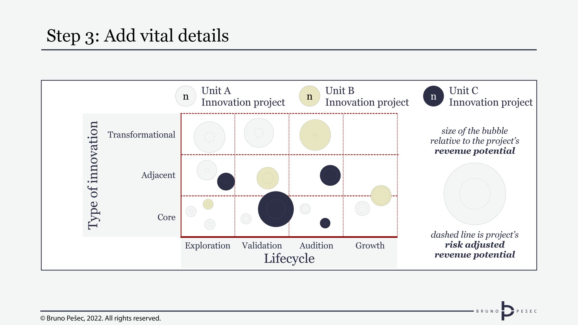
There is one more common question I encounter:
“Whose project is this?!”
I’d caution against going too granular on answering this. Keep it at business unit level, and definitely don’t bring it down to name level. This information can easily be added to the portfolio diagram with use of colours:
Suggested resources
You might find the following helpful:
 Bruno Pešec
 Bruno Pešec
 Bruno Pešec
 Bruno Pešec
 Bruno Pešec
 Bruno Pešec
 Bruno Pešec
Don’t stop here
Portfolios help you track your returns on investments in innovative projects. They aren’t just to be looked at, but to be used for funding decisions.
Couple them with an appropriately resourced Innovation Board, and you have the minimum viable governance needed for profitable corporate innovation.

Bruno Unfiltered
Subscribe to get the latest posts delivered right to your inbox. No spam. Only Bruno.


