Visual tools for understanding customers
Dig deeper into understanding customer's needs by using one of these three visual tools.
When describing faster horses fallacy I've written that it’s not a customer’s job to design the product – it’s the innovator’s job to understand customer’s needs as well as their current processes so they can innovate and create delightful products and services.
In Is investing 24 hours in understanding the problem worth it? I argued that you don’t need to set up an ethnographic division which would go and live with your customers, but you can invest in developing your customer development and lean startup skills to learn more about:
- what is the problem the customer has,
- what is the underserved need the customer has, and
- what are critical jobs-to-be-done that the the customer.
Visual tools enhance our sense-making, allowing us to see patterns that were perhaps not obvious before. They also help us with storytelling, as we work through the visual representation of what we know, what we wish to share, and what we want to focus on.
They also tend to be gimmicky and poorly thought through.
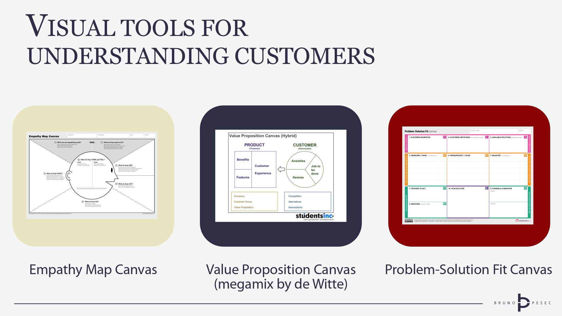
That's why I recommend following three proven tools:
- Empathy Map by Scott Matthews and Dave Gray,
- Value Proposition Canvas by Strategyzer, and
- Problem-Solution Fit Canvas by Daria Nepriakhina.
Since I've already covered Value Proposition Canvas, here I'll share with you a variant by Nils de Witte, which is useful for understanding some of the shortcomings of the original.
Empathy map
By Scott Matthews and Dave Gray. Download here.
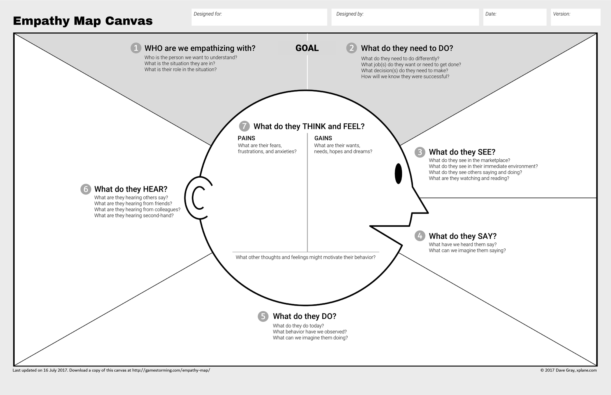
Featured as one of the tools in the Gamestorming book, updated in 2017. Fun fact, empathy map was an inspiration for the value proposition canvas.
When to use
Whenever you want to empathize with a specific customer or stakeholder:
The Empathy Map was created with a pretty specific set of ideas and is designed as a framework to complement an exercise in developing empathy. – Dave Gray
It works best if you have already defined customer segments you want to empathize with, and have an idea of what they need to do or want to achieve.
Since it doesn't require long introduction and uses plain English, it is well suited for beginners and teams that want to move fast.
How to use
Empathy map is quite easy to use, especially the updated version.
Follow the numbers on the canvas and answers prompting questions.
Your answers can be based on your assumption as well as observations.
I suggest you clearly differentiate between these two by using notes or text of different colour.
Aim to convert your assumptions to observations by conducting research and experiments.
If you get stuck, read the instructions in the following order:
- instructions for the updated version (scroll down to How to use it?),
- instructions for the original version, and finally
- instructions by Stanford d.school.
Value Proposition Canvas (de Witte megamix)
By Nils de Witte. Read here.
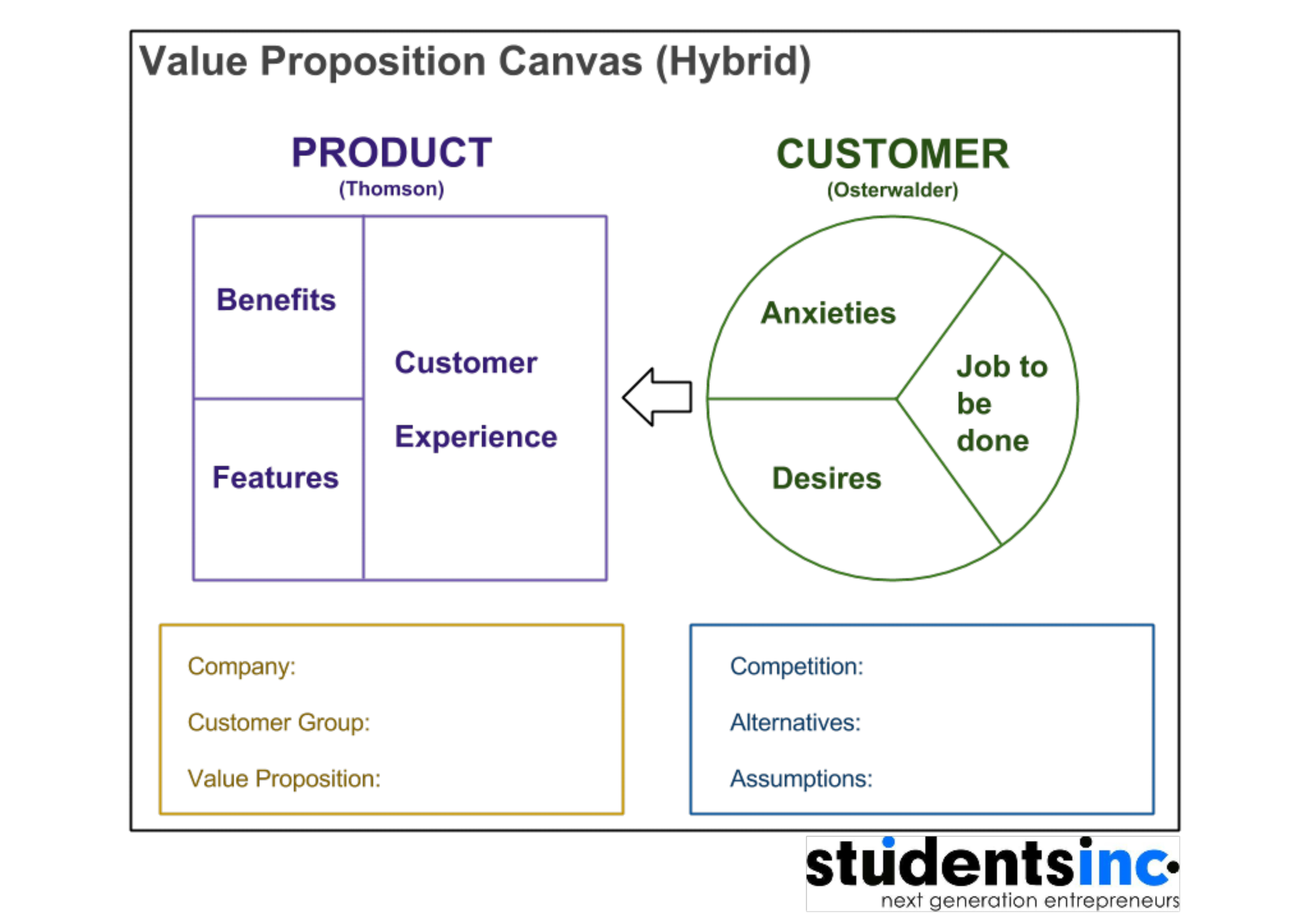
Many have attempted to modify the value proposition canvas – see modifications by Peter Thomson and Christina Wodtke for two noteworthy examples – and I find de Witte's take on it to be the most educational.
When to use
I find this version of the canvas most useful when training other innovation coaches and facilitators, since it highlights certain problems with the popular business model and value proposition canvases.
It also offers several solutions, which then can be used at the discretion of the coach.
Since fields do not have symmetrical counterparts that form a fit, it lacks visual coherence of the original canvas.
Due to increased number of fields, it's also more complex and requires deeper thinking, but provides richer outputs.
That's why I wouldn't advise it to any beginners, but rather to more mature practitioners who are looking to add more strategic elements to their use of the value proposition canvas.
Even if you decide against using it, reading de Witte's article is worthwhile.
How to use
If you want to use it as a canvas, then just do it the same way you'd use Business Model or Value Proposition Canvas.
If you want to use it as an educational tool, then contrast it with the canvases it is building upon, showing the progression and logic.
Problem-Solution Fit Canvas
By Daria Nepriakhina. Download here.
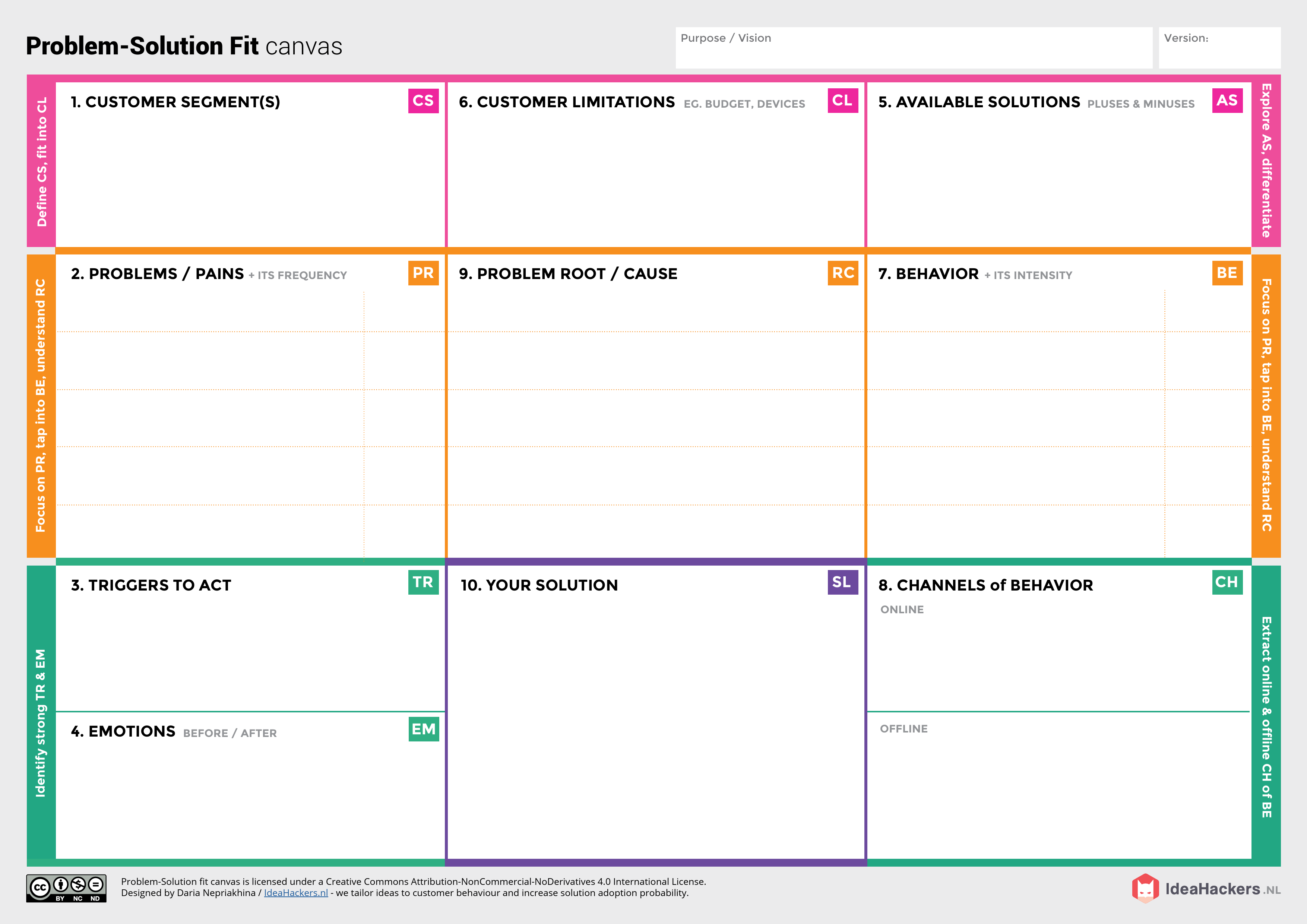
An interesting take on achieving problem-solution fit by explicitly including elements of lazy user theory and UX design.
When to use
I've experienced this canvas to be most useful to advanced practitioners, especially if they are in a permanent team (versus a short project or temporary team participating in a sprint or hackathon).
That way they have enough time to develop rich understanding of the customer segment, uncovering root causes of the problems, as well as behaviours and triggers.
Although it can be used for B2B cases, it really shines with B2C cases that don't have obvious customer problems.
How to use
In theory you can start anywhere, but I prefer to either follow the numbers, or work line by line (pink, orange, green).
Just like with the empathy map, you might start by filling in with assumptions, and then convert them to observations.
Daria explains the canvas and how to use it in this post.
There is also a workbook, which explains all blocks and has instructions for use.
Closing remarks
These aren't the only tools for visual inquiry into customer problems, needs, jobs, desires, anxieties.
On the contrary, you should couple them with other tools, be they visual or analytical, which will help you understand the context of the customer even better.
An example of former would be customer journey maps, while CATWOE analysis would be an example of latter.
It is critical to remember that these canvases and maps will most likely be filled out with assumptions that need to be further researched and experimented with.
Otherwise there is a risk we are acting upon mere wishful thinking.
And that can be an expensive mistake.
Bruno Unfiltered
Subscribe to get the latest posts delivered right to your inbox. No spam. Only Bruno.


